The simplicity of plain text emails
As much as we developers dislike working with them, clients love HTML emails (the ones they send anyway) and to be fair there are tangible benefits:
- Branding and other visual impact can be greater.
- Enticing images and visual calls-to-action can be included.
- Receipt tracking is possible.
- Many people seem to like them (when they get to see them as intended).
But I was pleased to read CSS Guru Chris Coyier's advice in a recent Smashing Magazine piece to a web designer struggling with cross-platform issues and looking for suggestions to make the process easier (his emphasis):
First and foremost, I recommend keeping emails very simple. Ask yourself what the primary message of the email is and how well the current design of the email is serving that. Could it simply be text? Would it be better if it was text? I find that's often true.
So do I.
Putting it to the A/B test
And so apparently did an IT exam website who sent out an offer to their subscribers, half of whom received a glossy HTML email complete with images, navigation and logos, and half a "plain text" version. The reported result: 200% more visits and 300% more revenue generated... from the "text-only" version.
Analytics Inspector: Plain text vs HTML email A/B Test
The only problem is that the so-called "plain text" emails were in fact just "plain", rather than plain text. HTML had been used, but only for basic layout and bullet points. Nonetheless they attributed the outcome to a number of factors worth considering:
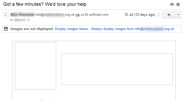
- For security reasons many email/webmail clients disable the display of images in messages by default. People often don't realise they need to give permission for the image assets to be loaded.
- The plain email had more room for textual content, which allowed it to be more personal by including representatives real names. (The glossy version should perhaps have included the same copy, but the imagery would still have made it less prominent.)
- The plain version, being simpler, loaded more reliably in email clients.
This is all consonant with my own experience of the downsides of HTML emails.
- I've seen the puzzled expression on my partner's face as she looks at a message in Gmail and wonders why it's so hard to read and what all the empty boxes are for.
- Clients have asked me why recipients have reported "gobbledy-gook" in the newsletter they've sent out. The reason: they've used poorly formed HTML to add fancy fonts or colours to their content.
- Corporate spam filters are often set to err on the side of caution and the mere presence of an HTML tag or MIME type can trigger rejection, regardless of content.
And then there is the enduring pain of creating, testing and maintaining the designs, not to mention the additional processing and bandwidth costs of all those extra bytes... although both problems can (and probably should) be addressed through out-sourcing.
Not getting it
There's no doubt that from a marketing perspective the power and impact of a well-designed HTML email trumps boring old plain text. But I'm not sure the marketers always understand the trade-offs involved.
Reliable delivery and presentation of well-written copy in a simple format may be preferable to the risk of poor or partial rendering, or non-delivery of a more complex, aesthetically pleasing message.